引言#
我一直在创建一些常见的可视化,例如散点图、条形图、蜂群图等等,并且想过尝试一些不同的东西。由于我是一个狂热的足球迷,我想到了用一些方法来表示球员在一个时期(一个赛季、几个赛季)内的使用情况或参与度。我见过一些很酷的可视化,比如圆环图,它可以描绘使用情况,我想做一些不同且易于理解的东西。我想到了用电池来表示球员的使用情况,这很有道理。
对于那些几乎没有被使用(出场时间较少)的球员,显示**大量的电池**,因为他们在储备能量方面还有很多剩余。而对于那些被大量使用的球员,则相反,即显示**耗尽或较少的电池**。
那么,电池图的目的是什么?你可以用它来显示使用情况、消耗情况、参与度、疲劳等等(任何与使用相关的方面)。
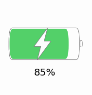
下图是电池在我们图表中外观的一个示例视图,尽管单个电池并不是我们在本教程中要重现的内容。
教程#
在开始教程之前,我想说明一下,该函数可以根据子图的数量或任何其他尺寸参数进行调整以使其适应。关于我们即将绘制的图表,需要考虑一系列步骤,我们将逐一遵循。以下是这些步骤:-
- 概述我们将绘制的内容
- 导入必要的库
- 编写一个绘制电池的函数
- 这是将被调用以绘制电池图的函数
- 读取数据并相应地绘制图表
- 我们将用一个例子来演示它
图表概述#
我们的用例是什么?
- 我们得到一个数据集,其中包含利物浦球员及其在过去两个赛季的出场时间数据(无论他们在那个时间段内为哪个俱乐部效力)。我们将使用此数据进行可视化。
- 最终的可视化效果是这篇博文的特色图片。我们将逐步了解如何创建可视化效果。
导入库#
首先要导入必要的库,以便我们能够利用其中的函数。在本例中,我们将导入所需的库。
import pandas as pd
import matplotlib.pyplot as plt
from matplotlib.path import Path
from matplotlib.patches import FancyBboxPatch, PathPatch, Wedge从matplotlib.path和matplotlib.patches导入的函数将用于绘制线条、矩形、框等,以显示电池本身。
绘制电池 - 函数#
接下来是定义一个名为draw_battery()的函数,该函数将用于绘制电池。稍后,我们将通过指定某些参数来调用此函数,以根据需要构建图形。以下是构建电池的代码:-
def draw_battery(
    fig,
    ax,
    percentage=0,
    bat_ec="grey",
    tip_fc="none",
    tip_ec="grey",
    bol_fc="#fdfdfd",
    bol_ec="grey",
    invert_perc=False,
):
    """
    Parameters
    ----------
    fig : figure
        The figure object for the plot
    ax : axes
        The axes/axis variable of the figure.
    percentage : int, optional
        This is the battery percentage - size of the fill. The default is 0.
    bat_ec : str, optional
        The edge color of the battery/cell. The default is "grey".
    tip_fc : str, optional
        The fill/face color of the tip of battery. The default is "none".
    tip_ec : str, optional
        The edge color of the tip of battery. The default is "grey".
    bol_fc : str, optional
        The fill/face color of the lightning bolt. The default is "#fdfdfd".
    bol_ec : str, optional
        The edge color of the lightning bolt. The default is "grey".
    invert_perc : bool, optional
        A flag to invert the percentage shown inside the battery. The default is False

    Returns
    -------
    None.

    """
    try:
        fig.set_size_inches((15, 15))
        ax.set(xlim=(0, 20), ylim=(0, 5))
        ax.axis("off")
        if invert_perc == True:
            percentage = 100 - percentage
        # color options - #fc3d2e red & #53d069 green & #f5c54e yellow
        bat_fc = (
            "#fc3d2e"
            if percentage <= 20
            else "#53d069" if percentage >= 80 else "#f5c54e"
        )

        """
        Static battery and tip of battery
        """
        battery = FancyBboxPatch(
            (5, 2.1),
            10,
            0.8,
            "round, pad=0.2, rounding_size=0.5",
            fc="none",
            ec=bat_ec,
            fill=True,
            ls="-",
            lw=1.5,
        )
        tip = Wedge(
            (15.35, 2.5), 0.2, 270, 90, fc="none", ec=bat_ec, fill=True, ls="-", lw=3
        )
        ax.add_artist(battery)
        ax.add_artist(tip)

        """
        Filling the battery cell with the data
        """
        filler = FancyBboxPatch(
            (5.1, 2.13),
            (percentage / 10) - 0.2,
            0.74,
            "round, pad=0.2, rounding_size=0.5",
            fc=bat_fc,
            ec=bat_fc,
            fill=True,
            ls="-",
            lw=0,
        )
        ax.add_artist(filler)

        """
        Adding a lightning bolt in the centre of the cell
        """
        verts = [
            (10.5, 3.1),  # top
            (8.5, 2.4),  # left
            (9.5, 2.4),  # left mid
            (9, 1.9),  # bottom
            (11, 2.6),  # right
            (10, 2.6),  # right mid
            (10.5, 3.1),  # top
        ]

        codes = [
            Path.MOVETO,
            Path.LINETO,
            Path.LINETO,
            Path.LINETO,
            Path.LINETO,
            Path.LINETO,
            Path.CLOSEPOLY,
        ]
        path = Path(verts, codes)
        bolt = PathPatch(path, fc=bol_fc, ec=bol_ec, lw=1.5)
        ax.add_artist(bolt)
    except Exception as e:
        import traceback

        print("EXCEPTION FOUND!!! SAFELY EXITING!!! Find the details below:")
traceback.print_exc()读取数据#
创建API或函数后,我们现在可以实现它。为此,我们需要输入所需的数据。在我们的示例中,我们有一个数据集,其中包含利物浦球员名单以及他们在过去两个赛季的出场时间。数据是从足球参考,即FBRef收集的。
我们使用pandas库中的read_excel函数来读取存储为excel文件的数据集。
data = pd.read_excel("Liverpool Minutes Played.xlsx")现在,让我们通过列出数据集的前五行来了解数据的外观:-
data.head()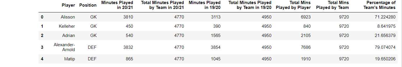
绘制数据#
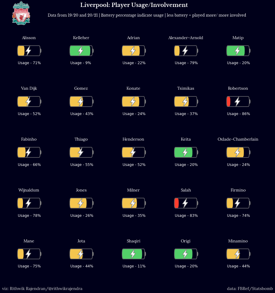
现在一切准备就绪,我们开始绘制数据。我们的数据集中有25名球员,因此5x5的图形是首选。我们还将添加一些标题并相应地设置颜色。
fig, ax = plt.subplots(5, 5, figsize=(5, 5))
facecolor = "#00001a"
fig.set_facecolor(facecolor)
fig.text(
    0.35,
    0.95,
    "Liverpool: Player Usage/Involvement",
    color="white",
    size=18,
    fontname="Libre Baskerville",
    fontweight="bold",
)
fig.text(
    0.25,
    0.92,
    "Data from 19/20 and 20/21 | Battery percentage indicate usage | less battery = played more/ more involved",
    color="white",
    size=12,
    fontname="Libre Baskerville",
)我们现在已经填写了合适的标题、图形大小等。下一步是绘制所有轴,即每个球员的电池。p是用于迭代数据框并获取每个球员数据的变量。draw_battery()函数调用显然会绘制电池。我们还会在其中添加所需的标签 - 在本例中为球员姓名和使用率/百分比。
p = 0  # The variable that'll iterate through each row of the dataframe (for every player)
for i in range(0, 5):
    for j in range(0, 5):
        ax[i, j].text(
            10,
            4,
            str(data.iloc[p, 0]),
            color="white",
            size=14,
            fontname="Lora",
            va="center",
            ha="center",
        )
        ax[i, j].set_facecolor(facecolor)
        draw_battery(fig, ax[i, j], round(data.iloc[p, 8]), invert_perc=True)
        """
        Add the battery percentage as text if a label is required
        """
        ax[i, j].text(
            5,
            0.9,
            "Usage - " + str(int(100 - round(data.iloc[p, 8]))) + "%",
            fontsize=12,
            color="white",
        )
        p += 1
现在一切几乎都完成了,我们进行一些最后的润色,无论如何这部分都是可选的。由于可视化重点关注利物浦球员,我添加了利物浦的徽标,并添加了我的水印。此外,为数据来源/提供者署名是一种更道德的做法,因此在显示图表之前,我们也进行此操作。
liv = Image.open("Liverpool.png", "r")
liv = liv.resize((80, 80))
liv = np.array(liv).astype(np.float) / 255
fig.figimage(liv, 30, 890)
fig.text(
    0.11,
    0.08,
    "viz: Rithwik Rajendran/@rithwikrajendra",
    color="lightgrey",
    size=14,
    fontname="Lora",
)
fig.text(
    0.8, 0.08, "data: FBRef/Statsbomb", color="lightgrey", size=14, fontname="Lora"
)
plt.show()因此,我们得到了下面的图表。你可以在draw_battery()函数中根据需要自定义设计 - 更改大小、颜色、形状等