搜索引擎优化 (SEO) 是一种旨在通过确保网站可以在搜索引擎中为与网站提供的服务相关的短语找到,从而增加网站流量的数量和质量的过程。Google 是世界上最受欢迎的搜索引擎,在顶级搜索结果中排名对任何在线业务都至关重要,因为点击率随着排名位置的下降而呈指数下降。从一开始,专门的实体一直在解码影响搜索引擎结果页面 (SERP) 排名的信号,例如关注外部链接数量、关键字的存在或内容长度。开发的实践通常会带来更好的可见性,但需要不断受到挑战,因为搜索引擎即使每天也会对其算法进行更改。随着大数据和机器学习的快速发展,找到重要的排名因素变得越来越困难。因此,整个 SEO 领域需要转变,即建议需要以基于真实数据的规模化研究为依据,而不是过时的实践。Whites Agency 重点关注数据驱动的 SEO。我们进行了许多大数据分析,这些分析为我们提供了对多种优化机会的洞察。
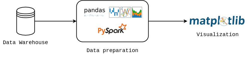
我们目前处理的大多数案例都集中在数据收集和分析上。数据展示发挥着重要作用,从一开始,我们就需要一个允许我们尝试不同可视化形式的工具。由于我们的组织是 Python 驱动的,Matplotlib 对我们来说是一个直接的选择。它是一个成熟的项目,提供灵活性,并进行控制。除了其他功能外,Matplotlib 图像不仅可以轻松导出到光栅图形格式 (PNG、JPG),还可以导出到矢量格式 (SVG、PDF、EPS),从而创建高质量的图像,这些图像可以嵌入到 HTML 代码、LaTeX 中,或被图形设计师使用。在我们其中一个项目中,Matplotlib 是 Python 处理管道的组成部分,该管道从 HTML 模板为单个客户自动生成 PDF 摘要。每个数据可视化项目都有相同的核心,如以下图所示,其中数据从数据库加载,在 pandas 或 PySpark 中处理,最后使用 Matplotlib 可视化。
接下来,我们想分享我们研究中的两个见解。所有图形均在 Matplotlib 中准备,在每种情况下,我们都设置了全局样式(必要时覆盖)
import matplotlib.pyplot as plt
from cycler import cycler

colors = ['#00b2b8', '#fa5e00', '#404040', '#78A3B3', '#008F8F', '#ADC9D6']

plt.rc('axes', grid=True, labelcolor='k', linewidth=0.8, edgecolor='#696969',
    labelweight='medium', labelsize=18)
plt.rc('axes.spines', left=False, right=False, top=False, bottom=True)
plt.rc('axes.formatter', use_mathtext=True)

plt.rcParams['axes.prop_cycle'] = cycler('color', colors)

plt.rc('grid', alpha=1.0, color='#B2B2B2', linestyle='dotted', linewidth=1.0)
plt.rc('xtick.major', top=False, width=0.8, size=8.0)
plt.rc('ytick', left=False, color='k')
plt.rcParams['xtick.color'] = 'k'
plt.rc('font',family='Montserrat')
plt.rcParams['font.weight'] = 'medium'
plt.rcParams['xtick.labelsize'] = 13
plt.rcParams['ytick.labelsize'] = 13
plt.rcParams['lines.linewidth'] = 2.0
案例 1:网站速度性能#
我们的研发部门分析了一组来自电子产品(电子商务)和新闻领域(每个 5000 个短语)的 10,000 个潜在客户意图短语。他们在特定位置(英国伦敦)抓取了 Google 排名的移动和桌面结果数据 [完整研究可此处获得]。根据这些数据,我们区分了出现在 SERP 中的 TOP 20 结果。接下来,使用Google Lighthouse 工具 对每个页面进行了审计。Google Lighthouse 是一个开源的自动工具,用于改进网页的质量,它除了收集其他信息外,还收集有关网站加载时间的信息。下面展示了我们分析中的一个单一示例,它显示了首次字节时间 (TTFB) 作为 Google 位置函数(按三个分组)的变化。TTFB 测量用户浏览器接收页面内容第一个字节所花费的时间。无论设备如何,对于出现在 TOP 3 位置的网站,TTFB 分数最低。这种差异非常明显,特别是在 TOP 3 和 4-6 结果之间。因此,Google 更倾向于响应速度快的网站,因此建议投资于网站速度优化。
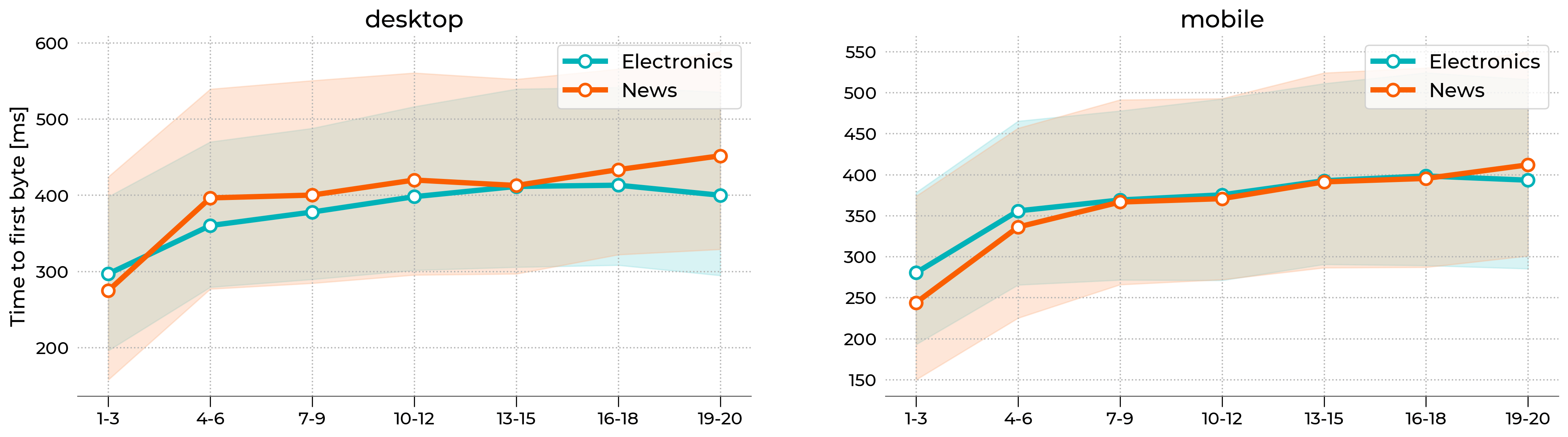
上图使用 Matplotlib 库中的fill_between 函数来绘制代表 40-60 个百分位数范围的彩色阴影。带圆形标记的简单折线图表示中位数(第 50 个百分位数)。X 轴标签是手动分配的。整个样式被包装在一个自定义函数中,该函数使我们能够在一行代码中重现整个图形。下面展示了一个示例
import matplotlib.pyplot as plt
from matplotlib.colors import LinearSegmentedColormap

# --------------------------------------------
# Set double column layout
# --------------------------------------------
fig, axx = plt.subplots(figsize=(20,6), ncols=2)

# --------------------------------------------
# Plot 50th percentile
# --------------------------------------------
line_kws = {
   'lw': 4.0,
   'marker': 'o',
   'ms': 9,
   'markerfacecolor': 'w',
   'markeredgewidth': 2,
   'c': '#00b2b8'
}

# just demonstration
axx[0].plot(x, y, label='Electronics', **line_kws)

# --------------------------------------------
# Plot 40-60th percentile
# --------------------------------------------
# make color lighter
cmap = LinearSegmentedColormap.from_list('whites', ['#FFFFFF', '#00b2b8'])

# just demonstration
axx[0].fill_between(
   x, yl, yu,
   color=cmap(0.5),
   label='_nolegend_'
)

# ---------------------------------------------
# Add x-axis labels
# ---------------------------------------------
# done automatically
xtick_labels = ['1-3','4-6','7-9','10-12','13-15','16-18','19-20']
for ax in axx:
   ax.set_xticklabels(xtick_labels)

# ----------------------------------------------
# Export figure
# ----------------------------------------------
fig.savefig("lighthouse.png", bbox_inches='tight', dpi=250)
案例 2:Google Ads 排名#
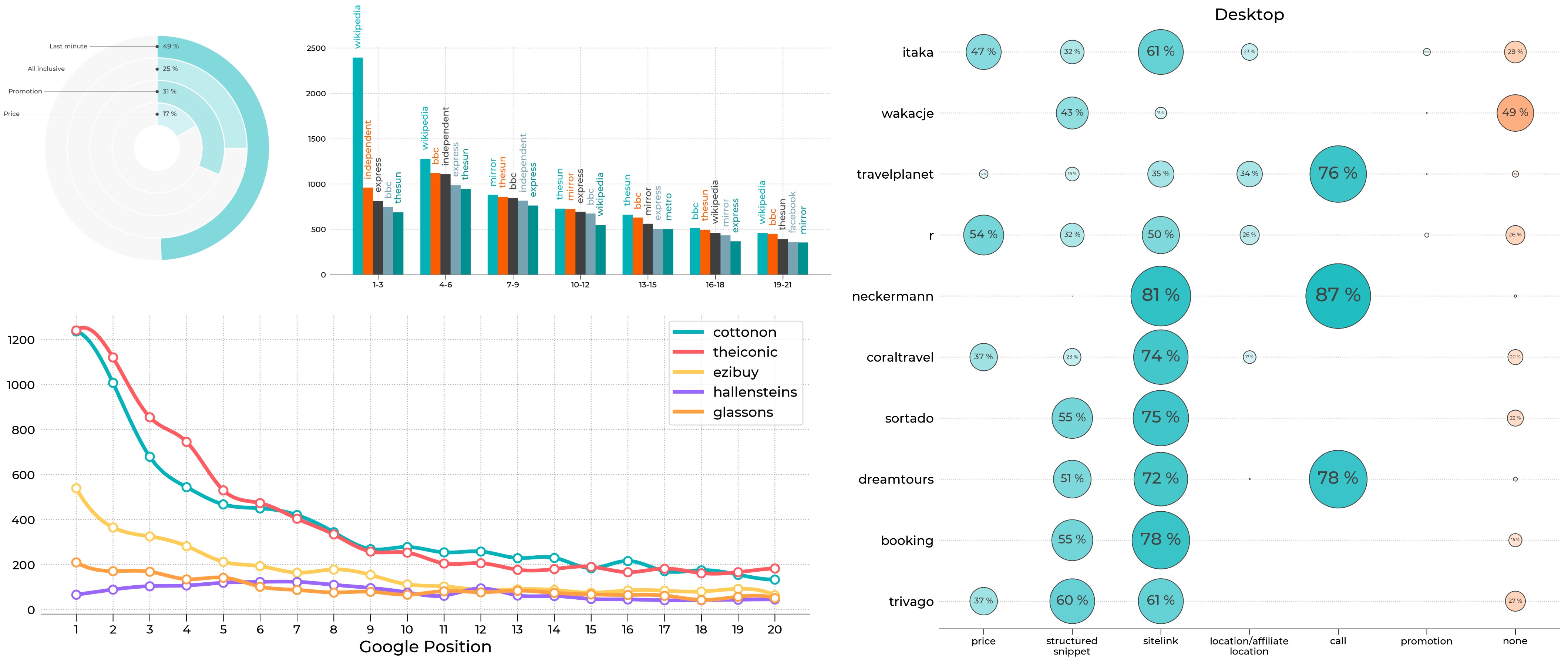
另一个示例让我们从 Google 的付费广告活动(广告)中获得见解。我们的研发部门抓取了 Google 中超过 7600 个查询的首页,并分析了存在的广告 [研究仅提供波兰语版本]。查询被缩小到旅行类别。在撰写本文时,每个 SERP 最多可以包含 4 个顶部广告和最多 3 个底部广告。每个广告都与一个域相关联,并具有标题、描述和可选扩展。下面,我们展示了在台式机上具有最高可见性的 TOP 25 域。Y 轴显示域的名称,X 轴表示与特定域链接的广告总数。我们重复了该研究 3 次并汇总了计数,因此该比例远大于 7600。在这个项目中,以下类型的图表使我们能够总结不同品牌的广告活动策略及其广告市场份额。例如,itaka 和wakacje 在移动设备和台式机上都具有最强的存在感,它们的大多数广告都出现在顶部。neckermann 的定位非常高,但它们的大多数广告都出现在搜索结果的底部。

上图是一个标准的水平条形图,可以通过 Matplotlib 中的barh 函数重现。每个 y 刻度都有 4 个不同的部分(参见图例)。我们还在每个条形的末尾添加了自动生成的计数数字,以提高可读性。代码片段如下所示
import matplotlib.pyplot as plt
import matplotlib.patches as mpatches
from matplotlib.colors import LinearSegmentedColormap, PowerNorm

# -----------------------------
# Set default colors
# -----------------------------
blues = LinearSegmentedColormap.from_list(name='WhitesBlues', colors=['#FFFFFF', '#00B3B8'], gamma=1.0)
oranges = LinearSegmentedColormap.from_list(name='WhitesOranges', colors=['#FFFFFF', '#FB5E01'], gamma=1.0)

# colors
desktop_top = blues(1.0)
desktop_bottom = oranges(1.0)
mobile_top = blues(0.5)
mobile_bottom = oranges(0.5)

# -----------------------------
# Prepare Figure
# -----------------------------
fig, ax = plt.subplots(figsize=(10,15))
ax.grid(False)

# -----------------------------
# Plot bars
# -----------------------------
# just demonstration

for name in yticklabels:
    # tmp_desktop - DataFrame with desktop data
    # tmp_mobile - DataFrame with mobile data

    ax.barh(cnt, tmp_desktop['top'], color=desktop_top, height=0.9)
    ax.barh(cnt, tmp_desktop['bottom'], left=tmp_desktop['top'], color=desktop_bottom, height=0.9)
    # text counter
    ax.text(tmp_desktop['all']+100, cnt, "%d" % tmp_desktop['all'], horizontalalignment='left',
            verticalalignment='center', fontsize=10)

    ax.barh(cnt-1, tmp_mobile['top'], color=mobile_top, height=0.9)
    ax.barh(cnt-1, tmp_mobile['bottom'], left=tmp_mobile['top'], color=mobile_bottom, height=0.9)
    ax.text(tmp_mobile['all']+100, cnt-1, "%d" % tmp_mobile['all'], horizontalalignment='left',
            verticalalignment='center', fontsize=10)


    yticks.append(cnt)

    cnt = cnt - 2.5

# -----------------------------
# set labels
# -----------------------------
ax.set_yticks(yticks)
ax.set_yticklabels(yticklabels)

# -----------------------------
# Add legend manually
# -----------------------------
legend_elements = [
    mpatches.Patch(color=desktop_top, label='desktop top'),
    mpatches.Patch(color=desktop_bottom, label='desktop bottom'),
    mpatches.Patch(color=mobile_top, label='mobile top'),
    mpatches.Patch(color=mobile_bottom, label='mobile bottom')
]

ax.legend(handles=legend_elements, fontsize=15)
总结#
这只是我们研究中的一个示例,更多信息可以在我们的网站上找到。Matplotlib 库满足了我们在视觉能力和灵活性方面的需求。它使我们能够在一行代码中创建标准图,以及通过其低级功能尝试不同的图形形式。借助 Matplotlib 提供的机会,我们可以以简单易读的方式呈现复杂的数据。