简介#
本教程将教你如何在 Matplotlib 中创建自定义表格,这些表格在设计和布局方面非常灵活。希望你能看到代码非常简单!事实上,我们将使用的主要方法是 ax.text() 和 ax.plot()。
我要感谢 Todd Whitehead,他为各种篮球队和球员创建了这种类型的表格。他对于表格的处理方法非常出色,因为设计简单,而且他能够有效地将数据传达给他的受众。我从他的方法中获得了很大的启发,想要在 Matplotlib 中实现类似的功能。
在开始本教程之前,我想先讨论一下我方法背后的逻辑,我认为它很有价值,可以迁移到其他可视化(和工具!)中。
因此,我希望你将表格视为结构高度组织化的散点图。让我解释一下原因:对我来说,散点图是最基本的图表类型(无论使用什么工具)。
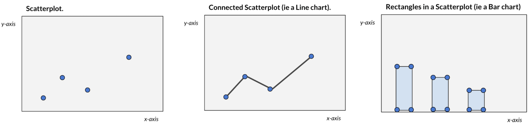
例如,ax.plot() 会自动“连接点”以形成折线图,或者 ax.bar() 会自动“在坐标集上绘制矩形”。很多时候(同样,无论使用什么工具),我们可能不会总是看到这个过程的发生。关键在于,将任何图表视为散点图或仅仅是基于 xy 坐标的形状集合是有用的。这种逻辑/思维过程可以解锁大量的自定义图表,因为你唯一需要的就是坐标(可以通过数学计算得出)。
有了这些想法,我们可以继续讨论表格!因此,我们不是绘制矩形或圆形,而是以高度组织的方式绘制文本和网格线。
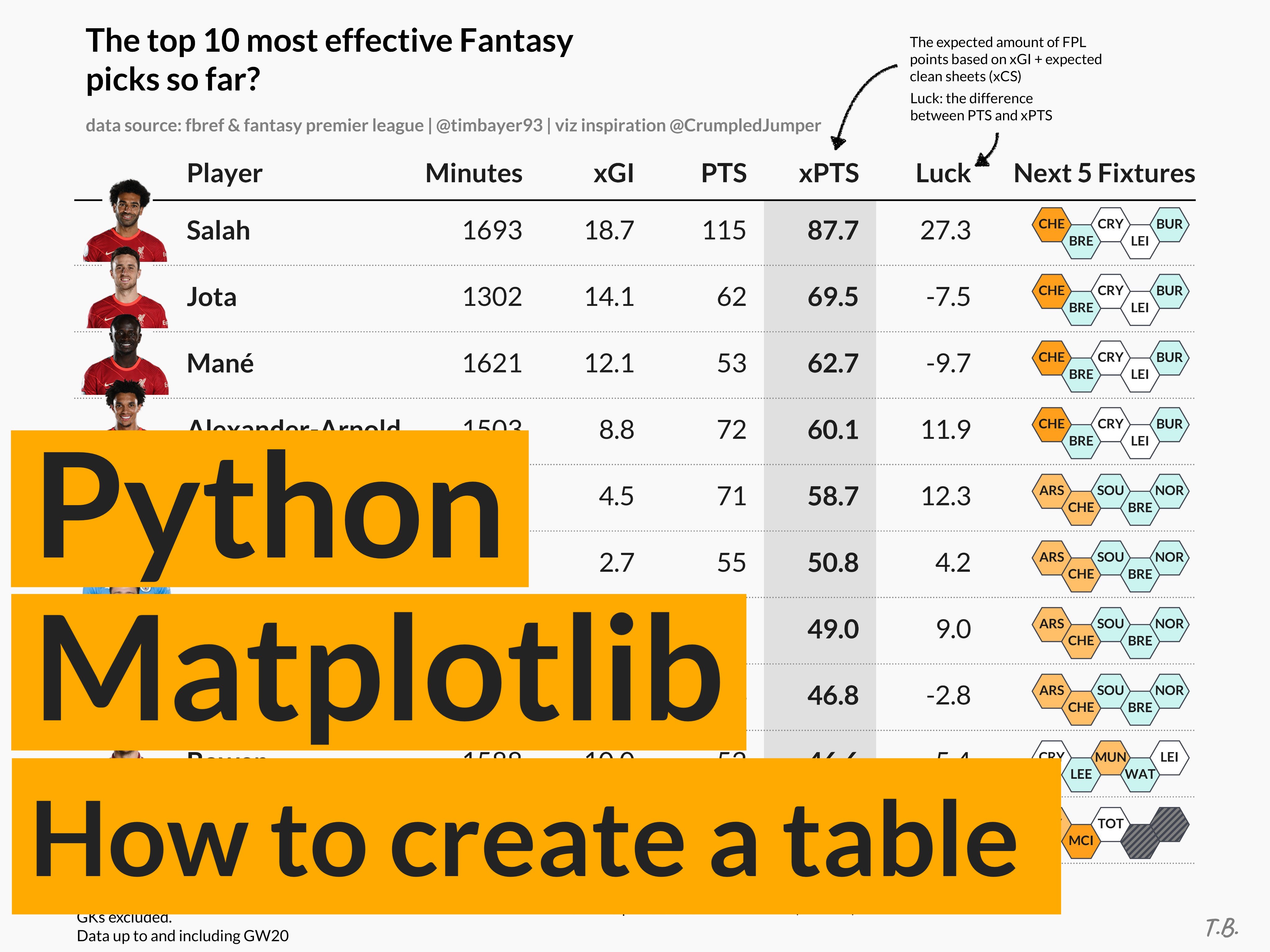
我们将目标创建一个这样的表格,我已经在 Twitter 上发布了 这里。请注意,除了 Matplotlib 之外,唯一添加的元素是花哨的箭头及其描述。
创建自定义表格#
导入所需的库。
import matplotlib as mpl
import matplotlib.patches as patches
from matplotlib import pyplot as plt
首先,我们需要设置一个坐标空间 - 我喜欢两种方法
- 使用标准的 Matplotlib 0-1 比例(在 x 轴和 y 轴上)或
- 基于行/列号的索引系统(这正是我将在本教程中使用的方法)
我想为包含 6 列和 10 行的表格创建一个坐标空间 - 这意味着(类似于 pandas 的行/列索引),每行将有一个介于 0-9 之间的索引,每列将有一个介于 0-6 之间的索引(从技术上讲,这比我们定义的多一列,但其中一列包含很多文本,将跨越两个列“索引”)。
# first, we'll create a new figure and axis object
fig, ax = plt.subplots(figsize=(8, 6))

# set the number of rows and cols for our table
rows = 10
cols = 6

# create a coordinate system based on the number of rows/columns
# adding a bit of padding on bottom (-1), top (1), right (0.5)
ax.set_ylim(-1, rows + 1)
ax.set_xlim(0, cols + 0.5)
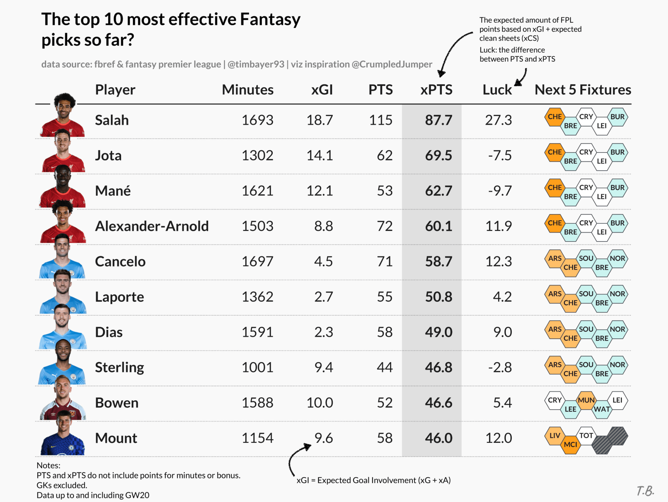
现在,我们想要绘制的数据是体育(足球)数据。我们有关于 10 名球员的信息,以及针对多个不同指标(将构成我们的列)的值,例如进球、射门、传球等。
# sample data
data = [
    {"id": "player10", "shots": 1, "passes": 79, "goals": 0, "assists": 1},
    {"id": "player9", "shots": 2, "passes": 72, "goals": 0, "assists": 1},
    {"id": "player8", "shots": 3, "passes": 47, "goals": 0, "assists": 0},
    {"id": "player7", "shots": 4, "passes": 99, "goals": 0, "assists": 5},
    {"id": "player6", "shots": 5, "passes": 84, "goals": 1, "assists": 4},
    {"id": "player5", "shots": 6, "passes": 56, "goals": 2, "assists": 0},
    {"id": "player4", "shots": 7, "passes": 67, "goals": 0, "assists": 3},
    {"id": "player3", "shots": 8, "passes": 91, "goals": 1, "assists": 1},
    {"id": "player2", "shots": 9, "passes": 75, "goals": 3, "assists": 2},
    {"id": "player1", "shots": 10, "passes": 70, "goals": 4, "assists": 0},
]
接下来,我们将开始绘制表格(作为结构化的散点图)。我承诺代码将非常简单,不到 10 行,这就是代码:
# from the sample data, each dict in the list represents one row
# each key in the dict represents a column
for row in range(rows):
    # extract the row data from the list
    d = data[row]

    # the y (row) coordinate is based on the row index (loop)
    # the x (column) coordinate is defined based on the order I want to display the data in

    # player name column
    ax.text(x=0.5, y=row, s=d["id"], va="center", ha="left")
    # shots column - this is my "main" column, hence bold text
    ax.text(x=2, y=row, s=d["shots"], va="center", ha="right", weight="bold")
    # passes column
    ax.text(x=3, y=row, s=d["passes"], va="center", ha="right")
    # goals column
    ax.text(x=4, y=row, s=d["goals"], va="center", ha="right")
    # assists column
    ax.text(x=5, y=row, s=d["assists"], va="center", ha="right")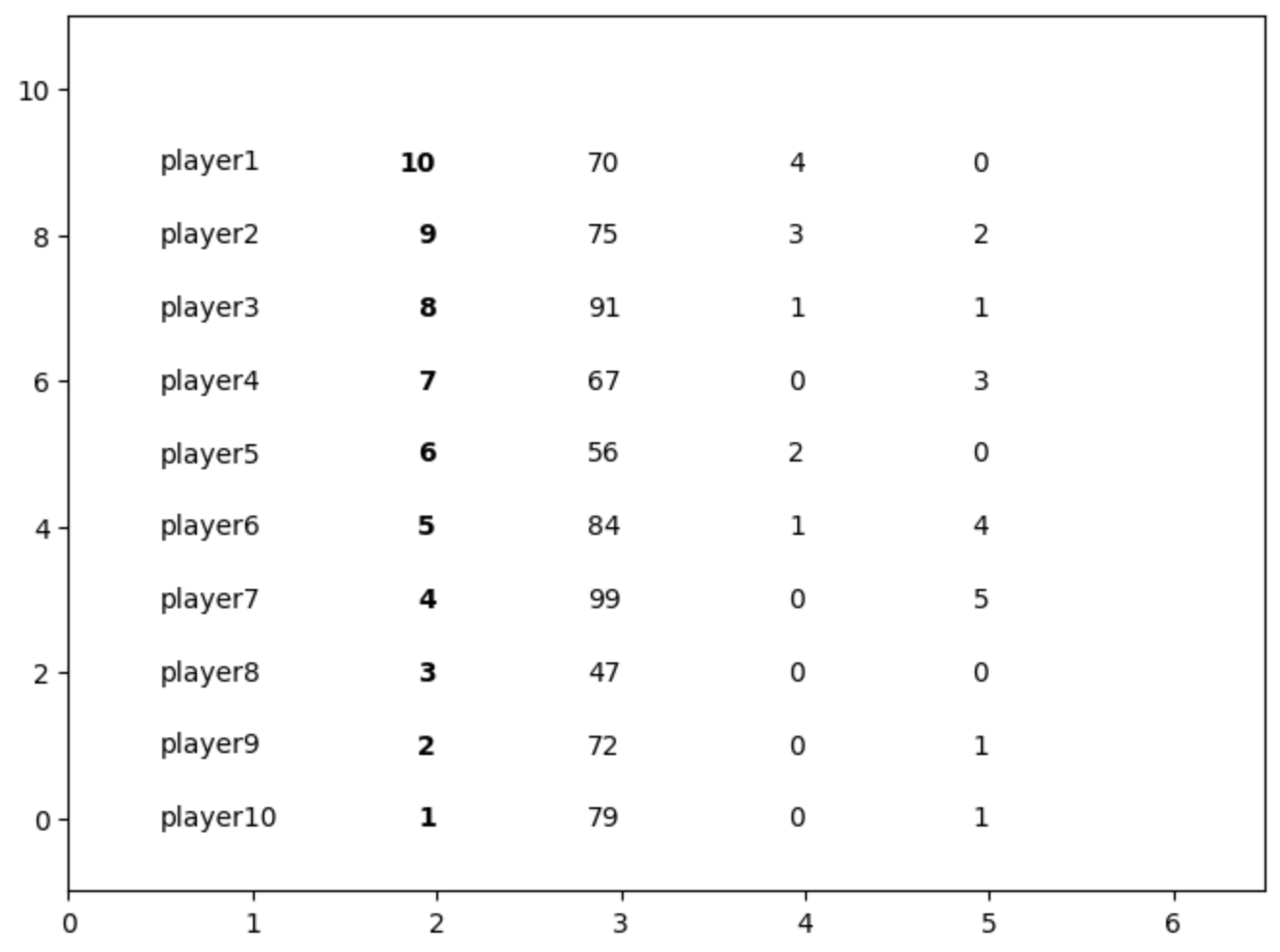
如你所见,我们开始得到表格的基本线框。让我们添加列标题,使这个散点图更像表格。
# Add column headers
# plot them at height y=9.75 to decrease the space to the
# first data row (you'll see why later)
ax.text(0.5, 9.75, "Player", weight="bold", ha="left")
ax.text(2, 9.75, "Shots", weight="bold", ha="right")
ax.text(3, 9.75, "Passes", weight="bold", ha="right")
ax.text(4, 9.75, "Goals", weight="bold", ha="right")
ax.text(5, 9.75, "Assists", weight="bold", ha="right")
ax.text(6, 9.75, "Special\nColumn", weight="bold", ha="right", va="bottom")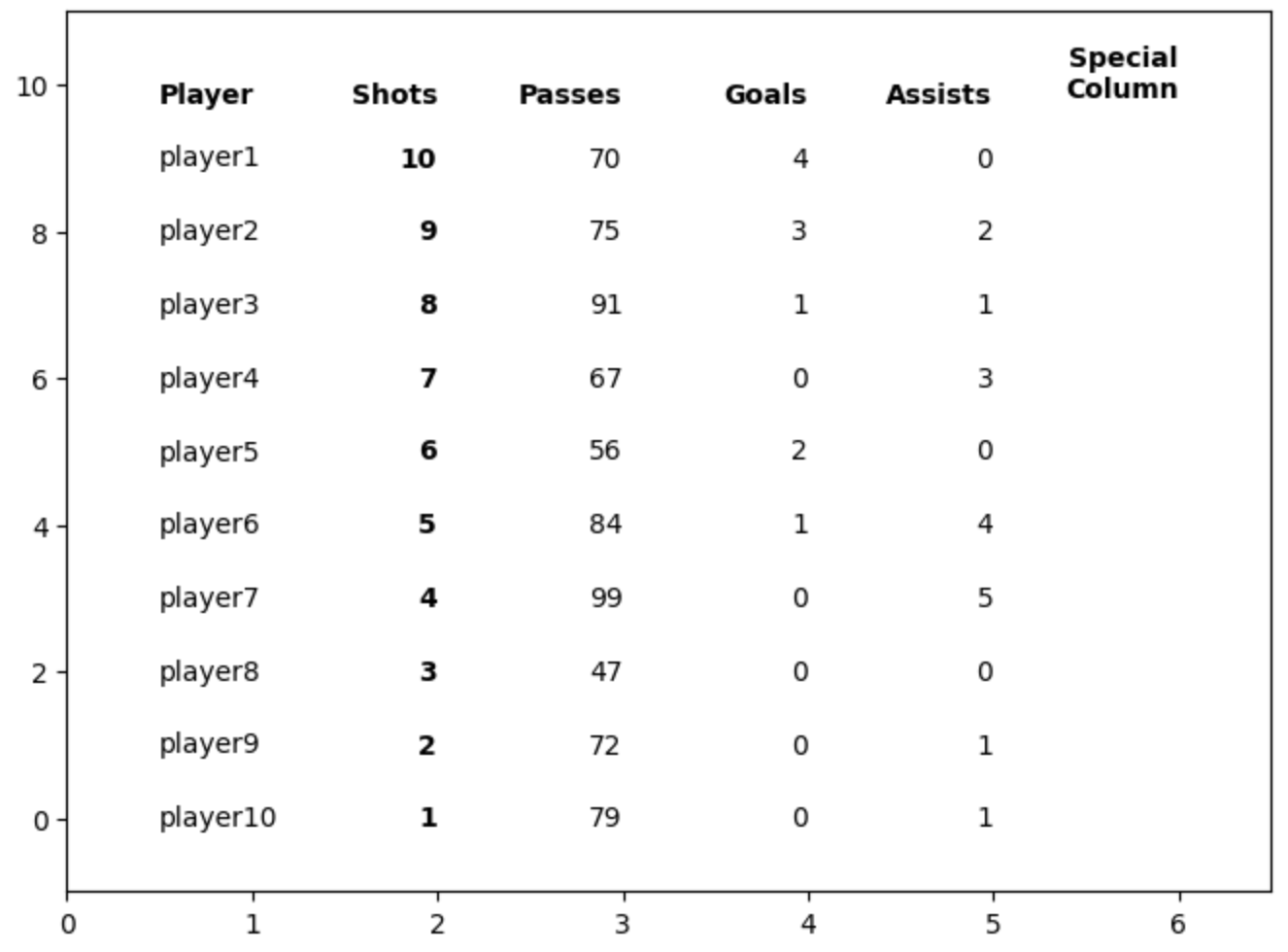
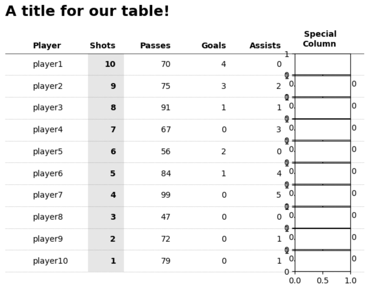
格式化表格#
表格的行和列现在已经完成了。剩下的唯一事情是格式化 - 其中大部分是个人喜好。我认为以下元素在表格设计方面普遍有用(了解更多研究 这里)。
网格线:某种程度的网格线很有用(越少越好)。通常,一些指导能够帮助受众追踪他们的眼睛或手指在屏幕上的移动,这很有帮助(这样我们也可以通过在周围绘制网格线来分组项目)。
for row in range(rows):
    ax.plot([0, cols + 1], [row - 0.5, row - 0.5], ls=":", lw=".5", c="grey")

# add a main header divider
# remember that we plotted the header row slightly closer to the first data row
# this helps to visually separate the header row from the data rows
# each data row is 1 unit in height, thus bringing the header closer to our
# gridline gives it a distinctive difference.
ax.plot([0, cols + 1], [9.5, 9.5], lw=".5", c="black")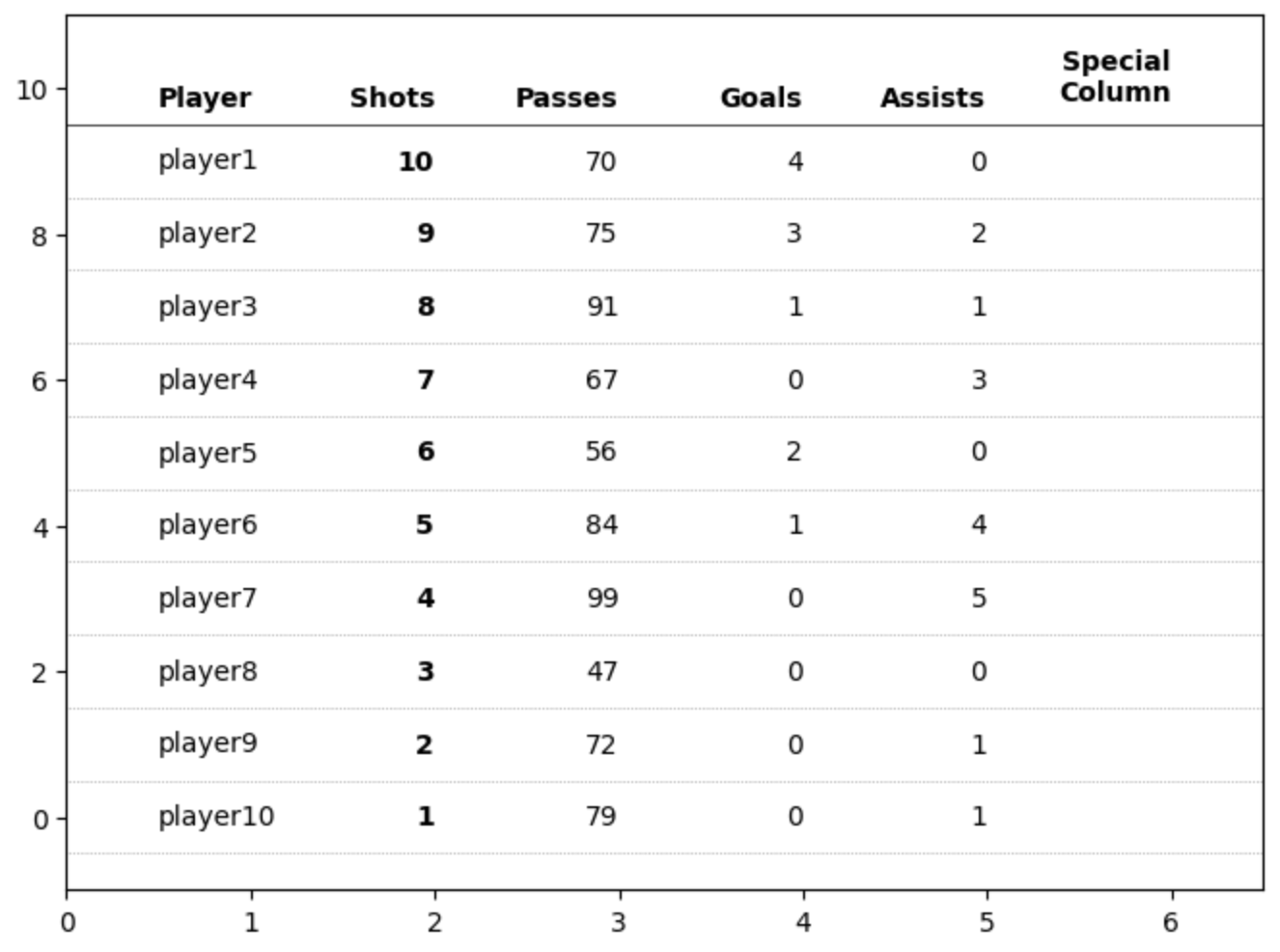
在我看来,表格的另一个重要元素是突出显示关键数据点。我们已经将“射门”列中的值加粗,但我们可以进一步对该列进行阴影处理,以将其对读者更重要。
# highlight the column we are sorting by
# using a rectangle patch
rect = patches.Rectangle(
    (1.5, -0.5),  # bottom left starting position (x,y)
    0.65,  # width
    10,  # height
    ec="none",
    fc="grey",
    alpha=0.2,
    zorder=-1,
)
ax.add_patch(rect)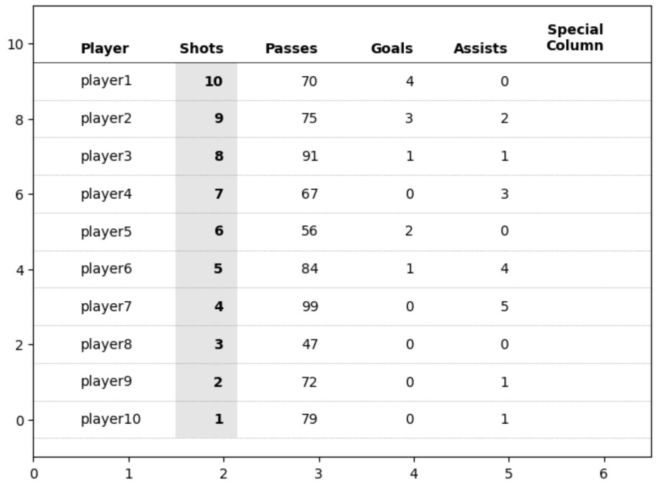
我们快到了。神奇之处在于 ax.axis('off')。这会隐藏轴、轴刻度、标签和与轴“相连”的所有内容,这意味着我们的表格现在看起来像一个干净的表格!
ax.axis("off")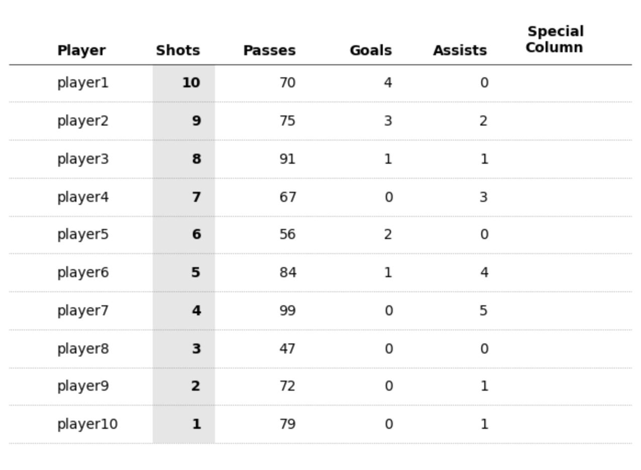
添加标题也很简单。
ax.set_title("A title for our table!", loc="left", fontsize=18, weight="bold")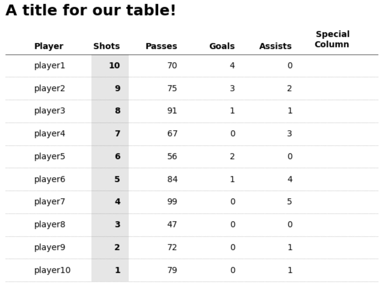
额外奖励:添加特殊列#
最后,如果你想添加图像、sparkline 或其他自定义形状和图案,我们也可以做到这一点。
为了实现这一点,我们将使用 fig.add_axes() 创建新的浮动轴,以基于图形坐标(这与我们的轴坐标系不同!)创建新的浮动轴集。
请记住,默认情况下,图形坐标介于 0 和 1 之间。[0,0] 是整个图形的左下角。如果你不熟悉图形和轴之间的区别,请查看 Matplotlib 的图形解剖图,了解更详细的信息。
newaxes = []
for row in range(rows):
    # offset each new axes by a set amount depending on the row
    # this is probably the most fiddly aspect (TODO: some neater way to automate this)
newaxes.append(fig.add_axes([0.75, 0.725 - (row * 0.063), 0.12, 0.06]))你可以在下面看到这些浮动轴的样子(我称之为浮动,因为它们位于我们的主轴对象之上)。唯一棘手的事情是确定这些轴的 xy(图形)坐标。
这些浮动轴的行为与任何其他 Matplotlib 轴一样。因此,我们可以访问相同的方法,例如 ax.bar()、ax.plot()、patch 等。重要的是,每个轴都有自己的独立坐标系。我们可以根据自己的意愿对它们进行格式化。
# plot dummy data as a sparkline for illustration purposes
# you can plot _anything_ here, images, patches, etc.
newaxes[0].plot([0, 1, 2, 3], [1, 2, 0, 2], c="black")
newaxes[0].set_ylim(-1, 3)

# once again, the key is to hide the axis!
newaxes[0].axis("off")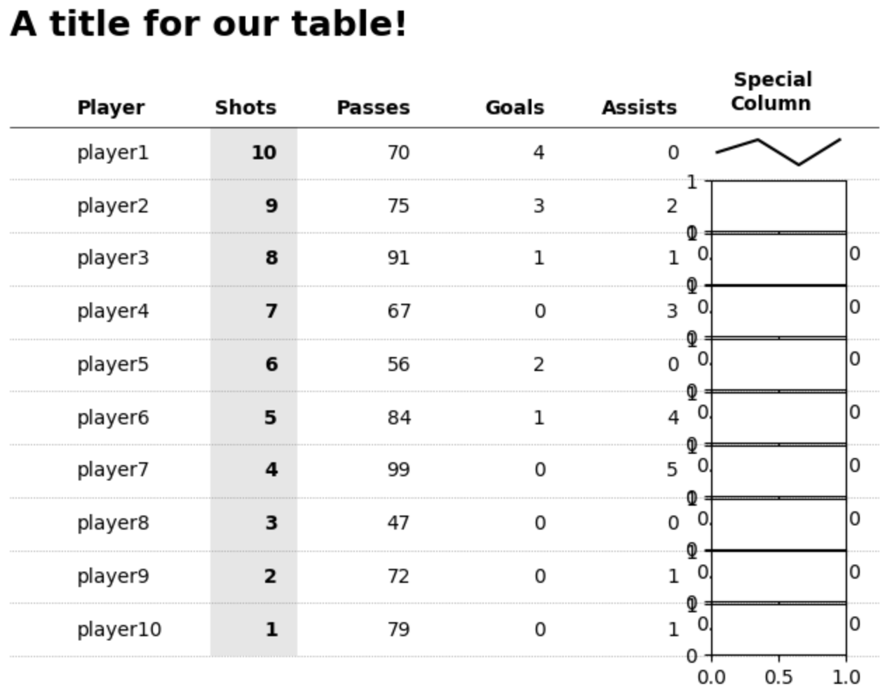
就是这样,Matplotlib 中的自定义表格。我确实承诺过非常简单的代码和非常灵活的设计,可以满足你的所有需求。你可以调整大小、颜色以及几乎所有内容,而你唯一需要的就是一个循环,以结构化和组织的方式绘制文本。希望你发现它有用。包含代码的 Google Colab 笔记本链接在 这里