
简介#
这篇文章将概述如何利用 gridspec 在 Matplotlib 中创建脊线图。虽然这是一个相对简单的教程,但具有一些使用 sklearn 的经验会更有益。当然,这是一项非常庞大的任务,这不会是一个 sklearn 教程,感兴趣的读者可以阅读文档 这里。但是,我将使用它来自 sklearn.neighbors 的 KernelDensity 模块。
软件包 #
import pandas as pd
import numpy as np
from sklearn.neighbors import KernelDensity

import matplotlib as mpl
import matplotlib.pyplot as plt
import matplotlib.gridspec as grid_spec
数据 #
我将使用我自己创建的一些模拟数据。如果你想一起玩,可以从 GitHub 这里获取数据集。该数据分析了按国家、年龄和性别细分的智力测试分数。
data = pd.read_csv("mock-european-test-results.csv")
| 国家 | 年龄 | 性别 | 分数 |
|---|---|---|---|
| 意大利 | 21 | 女性 | 0.77 |
| 西班牙 | 20 | 女性 | 0.87 |
| 意大利 | 24 | 女性 | 0.39 |
| 英国 | 20 | 女性 | 0.70 |
| 德国 | 20 | 男性 | 0.25 |
| … |
GridSpec #
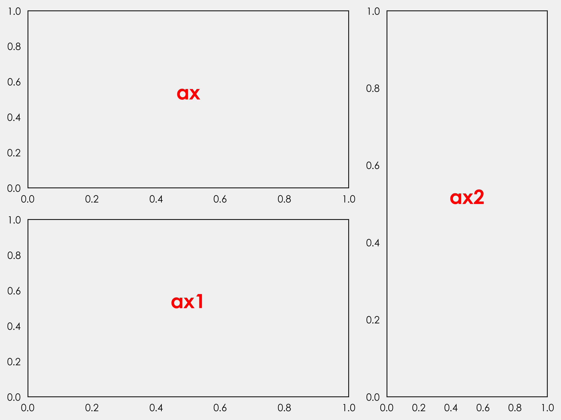
GridSpec 是一个 Matplotlib 模块,它允许我们轻松地创建子图。我们可以控制子图的数量、位置、高度、宽度以及它们之间的间距。作为一个基本的示例,让我们创建一个简单的模板。我们将重点关注的关键参数是 nrows、ncols 和 width_ratios。
nrows 和 ncols 将我们的图形划分为可以添加轴的区域。width_ratios 控制每个列的宽度。如果我们创建一个类似于 GridSpec(2,2,width_ratios=[2,1]) 的东西,我们将把图形细分为 2 行 2 列,并将宽度比率设置为 2:1,即第一列将占据图形两倍的宽度。
GridSpec 的好处是,现在我们已经创建了这些子集,我们并不受限于它们,正如我们将在下面看到的那样。
注意:我使用的是自己的主题,因此图形看起来会有所不同。创建自定义主题超出了本教程的范围(但我可能会在将来编写一个教程)。
gs = (grid_spec.GridSpec(2,2,width_ratios=[2,1]))

fig = plt.figure(figsize=(8,6))

ax = fig.add_subplot(gs[0:1,0])
ax1 = fig.add_subplot(gs[1:,0])
ax2 = fig.add_subplot(gs[0:,1:])

ax_objs = [ax,ax1,ax2]
n = ["",1,2]

i = 0
for ax_obj in ax_objs:
    ax_obj.text(0.5,0.5,"ax{}".format(n[i]),
                ha="center",color="red",
                fontweight="bold",size=20)
    i += 1

plt.show()
我不会在这里详细介绍每个部分的功能。如果你有兴趣了解更多关于图形、轴和 gridspec 的知识,Akash Palrecha 已经 在这里写了一篇非常棒的指南。
核密度估计 #
我们在这里有两个选择。最简单的方法是坚持使用 pandas 中内置的管道。只需要选择列并添加 plot.kde 即可。这默认为 Scott 带宽方法,但你可以选择 Silverman 方法,或添加你自己的方法。让我们再次使用 GridSpec 为每个国家绘制分布图。首先,我们将获取唯一的国家名称并创建一个颜色列表。
countries = [x for x in np.unique(data.country)]
colors = ['#0000ff', '#3300cc', '#660099', '#990066', '#cc0033', '#ff0000']
接下来,我们将循环遍历每个国家和颜色以绘制我们的数据。与上面不同,我们将不显式声明要绘制的行数。这样做的原因是为了使我们的代码更加动态。如果我们设置一个特定的行数和一个特定的轴对象数量,我们创建的是低效的代码。这是一个题外话,但在创建可视化效果时,我们应该始终力求减少和重用。通过减少,我们具体指的是减少我们声明的变量的数量以及与此相关的无关代码。我们正在为六个国家绘制数据,如果我们获得 20 个国家的数据怎么办?这将是很多额外的代码。相关的是,通过不显式声明这些变量,我们可以使代码适应性更强,并准备好编写脚本,以便在相同类型的新数据可用时自动创建新的图形。
gs = (grid_spec.GridSpec(len(countries),1))

fig = plt.figure(figsize=(8,6))

i = 0

#creating empty list
ax_objs = []

for country in countries:
    # creating new axes object and appending to ax_objs
    ax_objs.append(fig.add_subplot(gs[i:i+1, 0:]))

    # plotting the distribution
    plot = (data[data.country == country]
            .score.plot.kde(ax=ax_objs[-1],color="#f0f0f0", lw=0.5)
           )

    # grabbing x and y data from the kde plot
    x = plot.get_children()[0]._x
    y = plot.get_children()[0]._y

    # filling the space beneath the distribution
    ax_objs[-1].fill_between(x,y,color=colors[i])

    # setting uniform x and y lims
    ax_objs[-1].set_xlim(0, 1)
    ax_objs[-1].set_ylim(0,2.2)

    i += 1

plt.tight_layout()
plt.show()
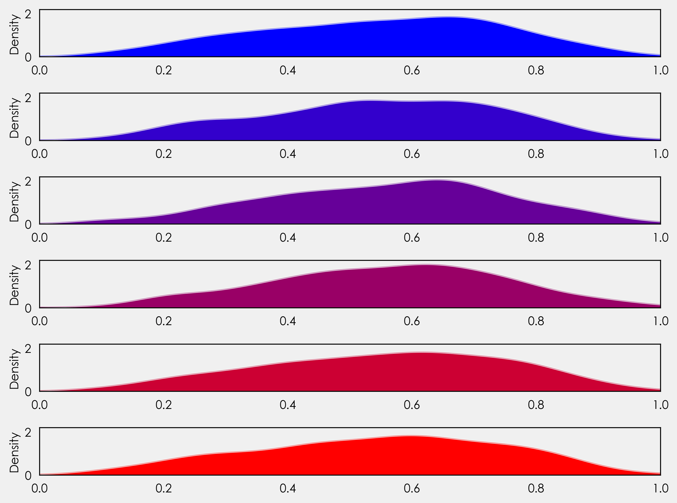
我们还没有到脊线图,但让我们看一下这里发生了什么。你会注意到,我们没有设置一个特定的行数,而是将其设置为我们国家列表的长度 - gs = (grid_spec.GridSpec(len(countries),1))。这为我们提供了灵活性的,让我们能够绘制更多或更少的国家,而无需调整代码。
在 for 循环之后,我们创建每个轴对象:ax_objs.append(fig.add_subplot(gs[i:i+1, 0:]))。在循环之前,我们声明了 i = 0。这里我们说的是从第 0 行到第 1 行创建轴对象,下次循环运行时它将从第 1 行到第 2 行创建轴对象,然后是 2 到 3、3 到 4,依此类推。
接着,我们可以使用 ax_objs[-1] 访问最后一个创建的轴对象,将其用作我们的绘图区域。
接下来,我们创建 kde 图。我们将其声明为一个变量,以便我们可以检索 x 和 y 值以用于后面的 fill_between。
重叠的轴对象 #
再次使用 GridSpec,我们可以调整每个子图之间的间距。我们可以通过在循环外添加一行来实现,在 plt.tight_layout() 之前。具体值将取决于你的分布,因此请随时尝试不同的值。
gs.update(hspace= -0.5)
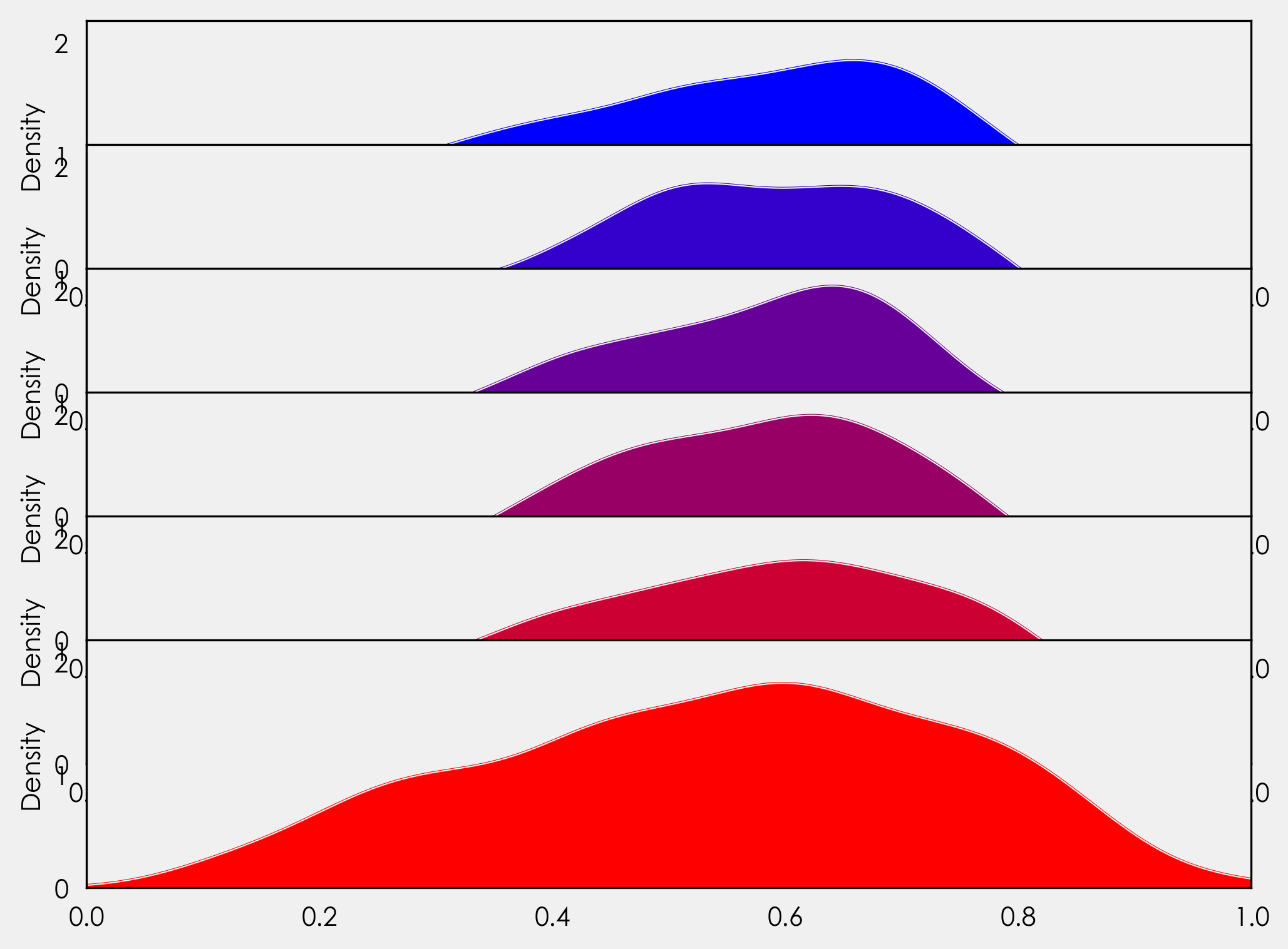
现在我们的轴对象重叠了!很棒,只是有一点问题。每个轴对象都隐藏了它下面的那个。我们可以在 for 循环中添加 ax_objs[-1].axis("off"),但如果这样做,我们将丢失 x 轴刻度标签。相反,我们将创建一个变量来访问每个轴对象的背景,然后循环遍历每个边框(脊柱)将其关闭。由于我们只需要最后一个图形的 x 轴刻度标签,我们将添加一个 if 语句来处理这个问题。我们还将在此处添加国家标签。在我们的 for 循环中,我们添加
# make background transparent
rect = ax_objs[-1].patch
rect.set_alpha(0)

# remove borders, axis ticks, and labels
ax_objs[-1].set_yticklabels([])
ax_objs[-1].set_ylabel('')

if i == len(countries)-1:
    pass
else:
    ax_objs[-1].set_xticklabels([])

spines = ["top","right","left","bottom"]
for s in spines:
    ax_objs[-1].spines[s].set_visible(False)

country = country.replace(" ","\n")
ax_objs[-1].text(-0.02,0,country,fontweight="bold",fontsize=14,ha="center")
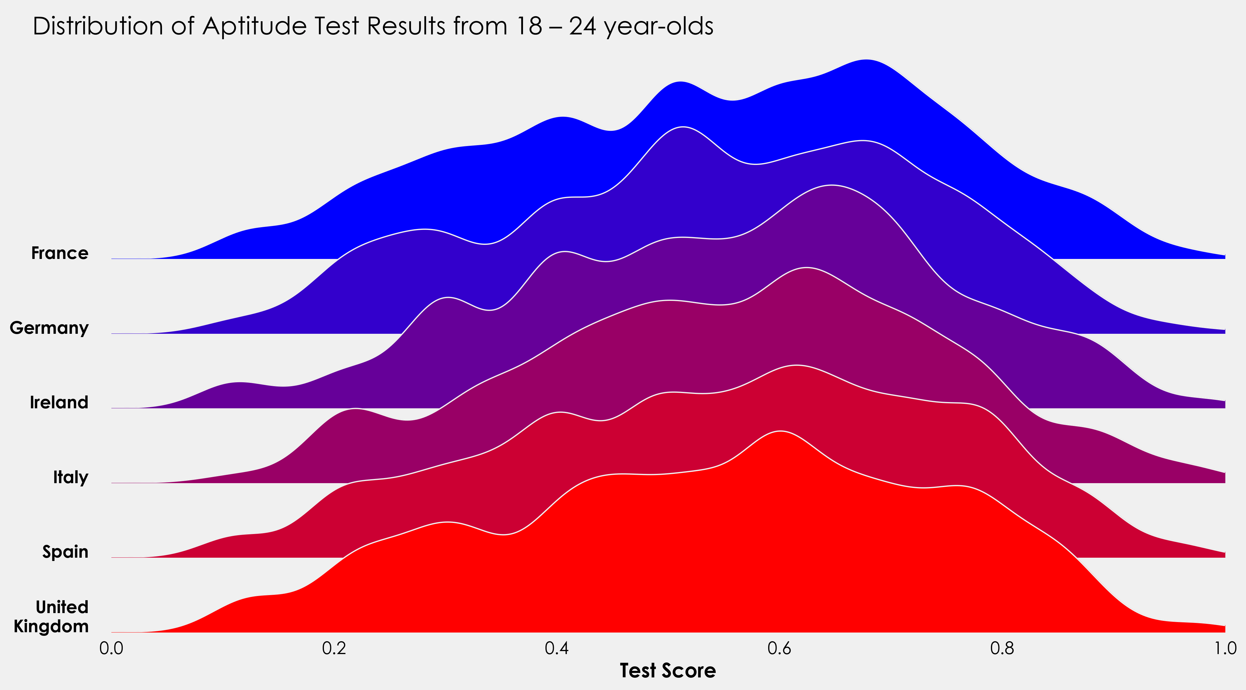
作为上述方法的替代方法,我们可以使用来自 sklearn.neighbors 的 KernelDensity 模块来创建我们的分布。这让我们对带宽有了更多的控制。这里的方法取自 Jake VanderPlas 的出色著作《Python 数据科学手册》,你可以阅读他在这里的完整摘录 这里。我们可以重用上面大部分的代码,但需要进行一些更改。为了避免重复,我将在这里添加完整的代码段,你可以查看更改和添加的内容(添加了标题、x 轴标签)。
完整的绘图代码段 #
countries = [x for x in np.unique(data.country)]
colors = ['#0000ff', '#3300cc', '#660099', '#990066', '#cc0033', '#ff0000']

gs = grid_spec.GridSpec(len(countries),1)
fig = plt.figure(figsize=(16,9))

i = 0

ax_objs = []
for country in countries:
    country = countries[i]
    x = np.array(data[data.country == country].score)
    x_d = np.linspace(0,1, 1000)

    kde = KernelDensity(bandwidth=0.03, kernel='gaussian')
    kde.fit(x[:, None])

    logprob = kde.score_samples(x_d[:, None])

    # creating new axes object
    ax_objs.append(fig.add_subplot(gs[i:i+1, 0:]))

    # plotting the distribution
    ax_objs[-1].plot(x_d, np.exp(logprob),color="#f0f0f0",lw=1)
    ax_objs[-1].fill_between(x_d, np.exp(logprob), alpha=1,color=colors[i])


    # setting uniform x and y lims
    ax_objs[-1].set_xlim(0,1)
    ax_objs[-1].set_ylim(0,2.5)

    # make background transparent
    rect = ax_objs[-1].patch
    rect.set_alpha(0)

    # remove borders, axis ticks, and labels
    ax_objs[-1].set_yticklabels([])

    if i == len(countries)-1:
        ax_objs[-1].set_xlabel("Test Score", fontsize=16,fontweight="bold")
    else:
        ax_objs[-1].set_xticklabels([])

    spines = ["top","right","left","bottom"]
    for s in spines:
        ax_objs[-1].spines[s].set_visible(False)

    adj_country = country.replace(" ","\n")
    ax_objs[-1].text(-0.02,0,adj_country,fontweight="bold",fontsize=14,ha="right")


    i += 1

gs.update(hspace=-0.7)

fig.text(0.07,0.85,"Distribution of Aptitude Test Results from 18 – 24 year-olds",fontsize=20)

plt.tight_layout()
plt.show()
我将用一个小项目来结束这个教程,并将上面的代码付诸实践。提供的数据还包含有关测试者是男性还是女性的信息。使用上面的代码作为模板,看看你是否能够创建一个像这样的图形。
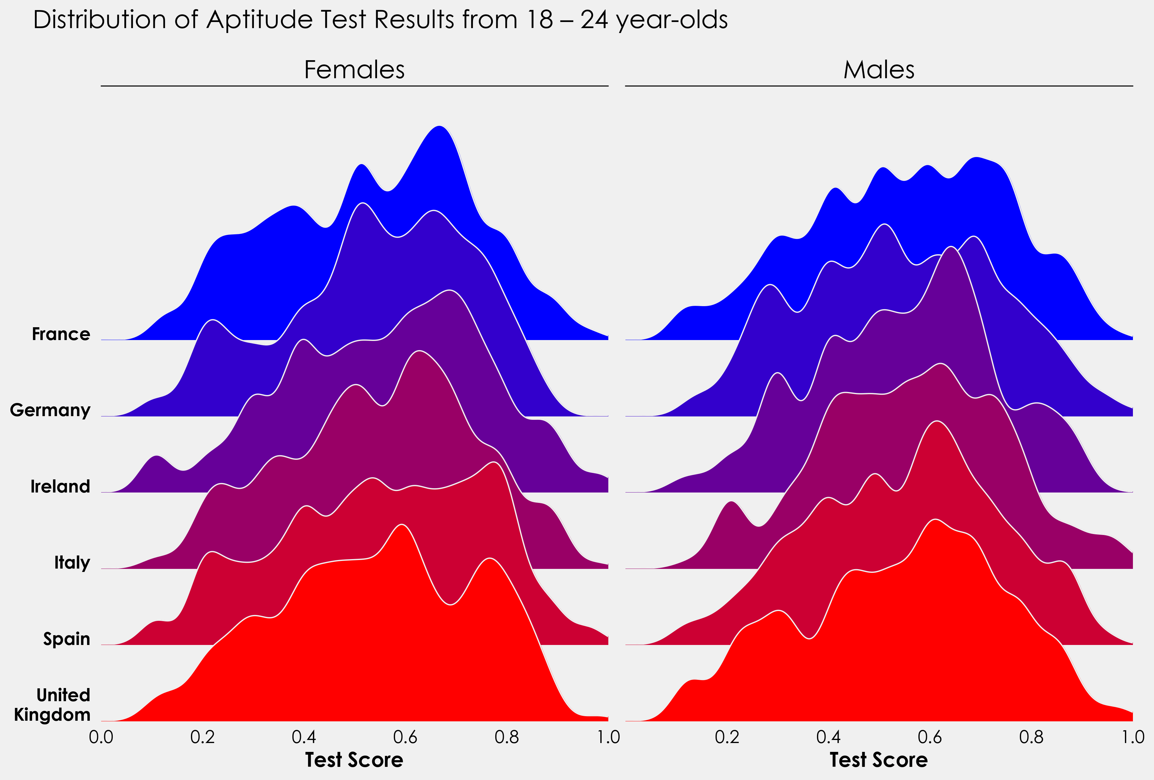
对于那些更有雄心壮志的人来说,这可以变成一个分裂的小提琴图,男性在一边,女性在另一边。有没有办法将脊线图和小提琴图结合起来?
我很想看看大家的结果,所以如果你真的创建了什么东西,请在 Twitter 上发给我 这里!