**海洋**是地球气候系统的重要组成部分。因此,需要对其进行持续的实时监测,以帮助科学家更好地理解其动态并预测其演变。世界各地的海洋学家已经成功地联合起来,建立了一个全球海洋观测系统,其中Argo是关键组成部分。Argo是一个全球网络,拥有近4000个自主探测器或浮标,每10天测量从水面到2000米深度的压力、温度和盐度。这些浮标的位置在南北纬60度之间几乎是随机的(参见实时覆盖这里)。所有数据都通过卫星实时收集,由多个数据中心处理,最终合并到一个单一的数据集中(收集超过200万个垂直剖面数据),并免费提供给任何人。
在本例中,我们想绘制这些浮标在2010年至2020年期间测量的(地表和1000米深)温度数据,并用于地中海区域。我们希望该图是圆形的并带有动画效果,现在您开始理解这篇文章的标题了:**动画极坐标图**。
首先,我们需要一些数据来处理。为了从Argo检索温度值,我们使用Argopy,这是一个Python库,旨在简化标准用户以及Argo专家和操作员对Argo数据的访问、操作和可视化。Argopy返回xarray数据集对象,这使得我们的分析更加容易。
import pandas as pd
import numpy as np
from argopy import DataFetcher as ArgoDataFetcher

argo_loader = ArgoDataFetcher(cache=True)

# Query surface and 1000m temp in Med sea with argopy
df1 = argo_loader.region(
    [-1.2, 29.0, 28.0, 46.0, 0, 10.0, "2009-12", "2020-01"]
).to_xarray()
df2 = argo_loader.region(
    [-1.2, 29.0, 28.0, 46.0, 975.0, 1025.0, "2009-12", "2020-01"]
).to_xarray()这里我们创建一些用于绘图的数组,我们设置了一个日期数组并提取了年份和一年中的日期,这将非常有用。然后,为了构建我们的温度数组,我们使用xarray非常有用的方法:where()和mean()。然后我们构建了一个pandas Dataframe,因为它更漂亮!
# Weekly date array
daterange = np.arange("2010-01-01", "2020-01-03", dtype="datetime64[7D]")
dayoftheyear = pd.DatetimeIndex(
    np.array(daterange, dtype="datetime64[D]") + 3
).dayofyear  # middle of the week
activeyear = pd.DatetimeIndex(
    np.array(daterange, dtype="datetime64[D]") + 3
).year  # extract year

# Init final arrays
tsurf = np.zeros(len(daterange))
t1000 = np.zeros(len(daterange))

# Filling arrays
for i in range(len(daterange)):
    i1 = (df1["TIME"] >= daterange[i]) & (df1["TIME"] < daterange[i] + 7)
    i2 = (df2["TIME"] >= daterange[i]) & (df2["TIME"] < daterange[i] + 7)
    tsurf[i] = df1.where(i1, drop=True)["TEMP"].mean().values
    t1000[i] = df2.where(i2, drop=True)["TEMP"].mean().values

# Creating dataframe
d = {"date": np.array(daterange, dtype="datetime64[D]"), "tsurf": tsurf, "t1000": t1000}
ndf = pd.DataFrame(data=d)
ndf.head()
这将产生
        date  tsurf  t1000
0 2009-12-31    0.0    0.0
1 2010-01-07    0.0    0.0
2 2010-01-14    0.0    0.0
3 2010-01-21    0.0    0.0
4 2010-01-28    0.0    0.0
然后是绘图时间,为此我们首先需要导入我们需要的内容,并设置一些有用的变量。
import matplotlib.pyplot as plt
import matplotlib

plt.rcParams["xtick.major.pad"] = "17"
plt.rcParams["axes.axisbelow"] = False
matplotlib.rc("axes", edgecolor="w")
from matplotlib.lines import Line2D
from matplotlib.animation import FuncAnimation
from IPython.display import HTML

big_angle = 360 / 12  # How we split our polar space
date_angle = (
    ((360 / 365) * dayoftheyear) * np.pi / 180
)  # For a day, a corresponding angle
# inner and outer ring limit values
inner = 10
outer = 30
# setting our color values
ocean_color = ["#ff7f50", "#004752"]现在我们想按照我们的意愿创建轴,为此我们构建了一个函数dress_axes,它将在动画过程中被调用。在这里,我们绘制了一些带有偏移量的条形图(在之后结合使用bottom和ylim)。这些条形图实际上是我们的背景,偏移量允许我们在图的中间绘制图例。
def dress_axes(ax):
    ax.set_facecolor("w")
    ax.set_theta_zero_location("N")
    ax.set_theta_direction(-1)
    # Here is how we position the months labels
    middles = np.arange(big_angle / 2, 360, big_angle) * np.pi / 180
    ax.set_xticks(middles)
    ax.set_xticklabels(
        [
            "January",
            "February",
            "March",
            "April",
            "May",
            "June",
            "July",
            "August",
            "September",
            "October",
            "November",
            "December",
        ]
    )
    ax.set_yticks([15, 20, 25])
    ax.set_yticklabels(["15°C", "20°C", "25°C"])
    # Changing radial ticks angle
    ax.set_rlabel_position(359)
    ax.tick_params(axis="both", color="w")
    plt.grid(None, axis="x")
    plt.grid(axis="y", color="w", linestyle=":", linewidth=1)
    # Here is the bar plot that we use as background
    bars = ax.bar(
        middles,
        outer,
        width=big_angle * np.pi / 180,
        bottom=inner,
        color="lightgray",
        edgecolor="w",
        zorder=0,
    )
    plt.ylim([2, outer])
    # Custom legend
    legend_elements = [
        Line2D(
            [0],
            [0],
            marker="o",
            color="w",
            label="Surface",
            markerfacecolor=ocean_color[0],
            markersize=15,
        ),
        Line2D(
            [0],
            [0],
            marker="o",
            color="w",
            label="1000m",
            markerfacecolor=ocean_color[1],
            markersize=15,
        ),
    ]
    ax.legend(handles=legend_elements, loc="center", fontsize=13, frameon=False)
    # Main title for the figure
    plt.suptitle(
        "Mediterranean temperature from Argo profiles",
        fontsize=16,
        horizontalalignment="center",
    )
从那里我们可以绘制图形的框架。
fig = plt.figure(figsize=(10, 10))
ax = fig.add_subplot(111, polar=True)
dress_axes(ax)
plt.show()
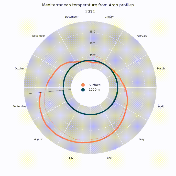
然后终于到了绘制我们的数据的时候了。由于我们希望使图形具有动画效果,因此我们将构建一个稍后将在FuncAnimation中调用的函数。由于图形的状态在每个时间戳上都会发生变化,因此我们必须为每一帧重新绘制轴,使用我们的dress_axes函数很容易。然后我们使用基本的plot()绘制温度数据:细线表示历史测量值,粗线表示当年测量值。
def draw_data(i):
    # Clear
    ax.cla()
    # Redressing axes
    dress_axes(ax)
    # Limit between thin lines and thick line, this is current date minus 51 weeks basically.
    # why 51 and not 52 ? That create a small gap before the current date, which is prettier
    i0 = np.max([i - 51, 0])

    ax.plot(
        date_angle[i0 : i + 1],
        ndf["tsurf"][i0 : i + 1],
        "-",
        color=ocean_color[0],
        alpha=1.0,
        linewidth=5,
    )
    ax.plot(
        date_angle[0 : i + 1],
        ndf["tsurf"][0 : i + 1],
        "-",
        color=ocean_color[0],
        linewidth=0.7,
    )

    ax.plot(
        date_angle[i0 : i + 1],
        ndf["t1000"][i0 : i + 1],
        "-",
        color=ocean_color[1],
        alpha=1.0,
        linewidth=5,
    )
    ax.plot(
        date_angle[0 : i + 1],
        ndf["t1000"][0 : i + 1],
        "-",
        color=ocean_color[1],
        linewidth=0.7,
    )

    # Plotting a line to spot the current date easily
    ax.plot([date_angle[i], date_angle[i]], [inner, outer], "k-", linewidth=0.5)
    # Display the current year as a title, just beneath the suptitle
    plt.title(str(activeyear[i]), fontsize=16, horizontalalignment="center")


# Test it
draw_data(322)
plt.show()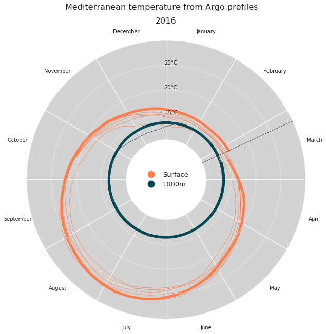
最后是动画时间,使用FuncAnimation。然后我们将其保存为mp4文件,或者使用HTML(anim.to_html5_video())在我们的笔记本中显示它。
anim = FuncAnimation(
    fig, draw_data, interval=40, frames=len(daterange) - 1, repeat=False
)
# anim.save('ArgopyUseCase_MedTempAnimation.mp4')
HTML(anim.to_html5_video())