预备知识#
import numpy as np
import matplotlib.pyplot as plt
import matplotlib as mpl
可以在 这里找到包含此博客确切内容的顶层可运行 Jupyter 笔记本
可以在 Google Colab上访问此指南的交互式版本
在我们开始之前的一句话…#
虽然初学者可以遵循本指南,但它主要是针对至少了解 Matplotlib 绘图功能工作原理的人员。
本质上,如果您知道如何将 2 个 NumPy 数组绘制到单个图形中的 2 个不同轴上(使用适当的图形类型)并对其进行基本样式设置,那么您就可以遵循本指南的目的。
如果您觉得需要对基本 Matplotlib 绘图进行一些介绍,这里有一份很棒的指南可以帮助您了解 使用 Matplotlib 进行入门绘图
从现在开始,我将假设您已经获得了足够的知识来遵循本指南。
此外,为了节省每个人的时间,我会使我的解释简短、简洁,直击要点,有时会让读者自行解释(因为这正是我在整个指南中为自己做的事情)。
整个练习的主要驱动因素将是代码而不是文本,我鼓励您启动一个 Jupyter 笔记本,亲手输入并尝试所有内容,以最大限度地利用此资源。
本指南的内容及其非内容:#
这不是关于如何使用 Matplotlib 美观地绘制不同类型数据的指南,互联网上充满了这种教程,这些教程是由比我更擅长解释它的人编写。
本文试图解释您使用 Matplotlib 创建的任何图形的某些基础工作原理。我们主要避免关注我们正在绘制的数据,而是关注图形的解剖结构。
设置#
Matplotlib 提供了许多可用的样式,我们可以使用以下方法查看可用选项
plt.style.available['seaborn-dark',
'seaborn-darkgrid',
'seaborn-ticks',
'fivethirtyeight',
'seaborn-whitegrid',
'classic',
'_classic_test',
'fast',
'seaborn-talk',
'seaborn-dark-palette',
'seaborn-bright',
'seaborn-pastel',
'grayscale',
'seaborn-notebook',
'ggplot',
'seaborn-colorblind',
'seaborn-muted',
'seaborn',
'Solarize_Light2',
'seaborn-paper',
'bmh',
'tableau-colorblind10',
'seaborn-white',
'dark_background',
'seaborn-poster',
'seaborn-deep']
我们将使用seaborn。这样做如下所示
plt.style.use("seaborn")让我们开始吧!
# Creating some fake data for plotting
xs = np.linspace(0, 2 * np.pi, 400)
ys = np.sin(xs**2)

xc = np.linspace(0, 2 * np.pi, 600)
yc = np.cos(xc**2)探索#
使用 Matplotlib 创建图形的常用方法如下所示
fig, ax = plt.subplots(2, 2, figsize=(16, 8))
# `Fig` is short for Figure. `ax` is short for Axes.
ax[0, 0].plot(xs, ys)
ax[1, 1].plot(xs, ys)
ax[0, 1].plot(xc, yc)
ax[1, 0].plot(xc, yc)
fig.suptitle("Basic plotting using Matplotlib")
plt.show()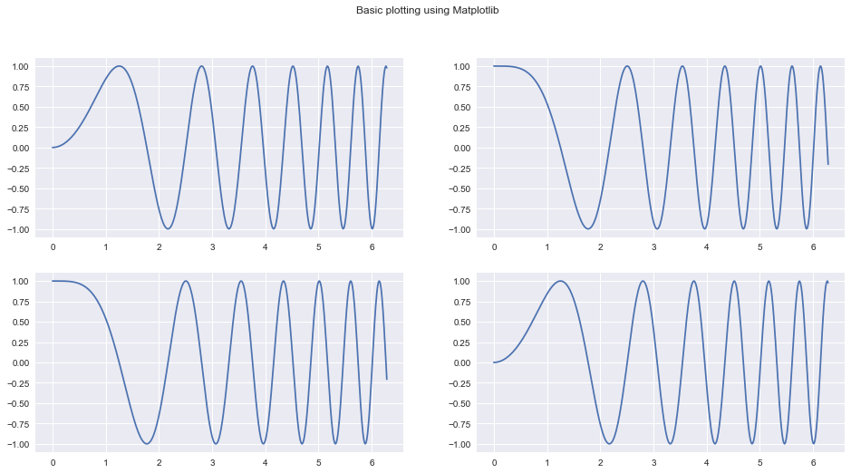
我们今天的目标是拆解前面代码片段,并充分了解所有底层构建块,以便我们可以单独使用它们,并以更强大的方式使用它们。
如果您像我在写这篇指南之前一样是初学者,请相信我:这一切都很简单。
进入 plt.subplots 文档(在 Jupyter 笔记本中按Shift+Tab+Tab),会显示一些其他 Matplotlib 内部组件,它使用这些内部组件为我们提供Figure及其Axes。
这些包括
plt.subplotplt.figurempl.figure.Figurempl.figure.Figure.add_subplotmpl.gridspec.GridSpecmpl.axes.Axes
让我们尝试了解这些函数/类的作用。
什么是Figure?什么是Axes?#
Matplotlib 中的 Figure 只是您主要的(想象的)画布。您将在其中进行所有绘图/绘制/放置图像以及其他操作。这是您始终交互的中心对象。图形在创建时会为其定义大小。
您可以像这样定义一个图形(这两个语句等效)
fig = mpl.figure.Figure(figsize=(10, 10))
# OR
fig = plt.figure(figsize=(10, 10))请注意上面提到的想象的这个词。这意味着 Figure 本身没有任何地方可以进行绘图。您需要将一个 Axes 附加/添加到它,才能进行任何类型的绘图。您可以在创建的任何Figure中放入任意数量的Axes对象。
一个Axes
- 有一个空间(就像一张空白页面),您可以在其中绘制/绘制数据。
- 一个父
Figure - 具有指示它将被放置在父
Figure中的位置的属性。 - 具有以不同方式绘制/绘制不同类型数据并添加自定义样式的方法。
您可以像这样创建一个Axes(这两个语句等效)
ax1 = mpl.axes.Axes(fig=fig, rect=[0, 0, 0.8, 0.8], facecolor="red")
# OR
ax1 = plt.Axes(fig=fig, rect=[0, 0, 0.8, 0.8], facecolor="red")
#第一个参数fig只是一个指向Axes所属的父Figure的指针。
第二个参数rect有四个数字:[left_position, bottom_position, height, width],用于定义Axes在Figure内的位置以及相对于Figure的高度和宽度。所有这些数字都以百分比表示。
一个Figure在任何时间点都只包含给定数量的Axes
我们将在片刻后深入研究其中一些设计决策。
使用基本 Matplotlib 功能重新创建plt.subplots#
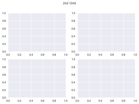
我们将尝试使用 Matplotlib 原语重新创建以下图形,以更好地理解它们。我们会尝试稍微创造性地进行一些偏差。
fig, ax = plt.subplots(2, 2)
fig.suptitle("2x2 Grid")
Text(0.5, 0.98, '2x2 Grid')
让我们使用 Matplotlib 原语创建我们的第一个图形:#
# We first need a figure, an imaginary canvas to put things on
fig = plt.Figure(figsize=(6, 6))
# Let's start with two Axes with an arbitrary position and size
ax1 = plt.Axes(fig=fig, rect=[0.3, 0.3, 0.4, 0.4], facecolor="red")
ax2 = plt.Axes(fig=fig, rect=[0, 0, 1, 1], facecolor="blue")现在您需要将Axes添加到fig中。您应该在这里停下来,思考为什么当fig已经是ax1和ax2的父对象时,需要这样做?无论如何,让我们这样做,我们将在后面详细说明。
fig.add_axes(ax2)
fig.add_axes(ax1)
<matplotlib.axes._axes.Axes at 0x1211dead0>
# As you can see the Axes are exactly where we specified.
fig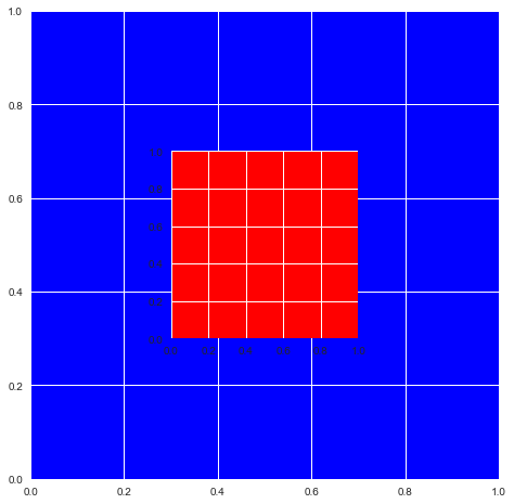
这意味着您现在可以这样做
说明:请注意下面的代码段中的
ax.reverse()调用。如果我没有这样做,最大的图形将被放置在最后,位于其他所有图形的顶部,您只会看到一个空白的“青色”图形。
fig = plt.figure(figsize=(6, 6))
ax = []
sizes = np.linspace(0.02, 1, 50)
for i in range(50):
    color = str(hex(int(sizes[i] * 255)))[2:]
    if len(color) == 1:
        color = "0" + color
    color = "#99" + 2 * color
    ax.append(plt.Axes(fig=fig, rect=[0, 0, sizes[i], sizes[i]], facecolor=color))

ax.reverse()
for axes in ax:
    fig.add_axes(axes)
plt.show()
上面的示例说明了为什么将Axes的创建过程与实际将其放置到Figure上分离很重要。
此外,您可以从Figure的画布区域中删除一个Axes,如下所示
fig.delaxes(ax)当您要将相同主要数据(GDP)与多个次要数据源(教育、支出等)进行逐一比较时,这很有用(您需要依次将每个图形添加到 Figure 中并从中删除)
我还鼓励您查看Figure和Axes的文档,并浏览一下它们可用的多种方法。这将有助于您了解下次使用这些对象时,您不需要重建哪些部分。
从头开始重新创建我们的子图#
现在应该有意义了。现在我们可以使用我们到目前为止所学到的知识来创建原始的plt.subplots(2, 2)示例。
(虽然这绝对不是最方便的方法)
fig = mpl.figure.Figure()
fig

fig.suptitle("Recreating plt.subplots(2, 2)")

ax1 = mpl.axes.Axes(fig=fig, rect=[0, 0, 0.42, 0.42])
ax2 = mpl.axes.Axes(fig=fig, rect=[0, 0.5, 0.42, 0.42])
ax3 = mpl.axes.Axes(fig=fig, rect=[0.5, 0, 0.42, 0.42])
ax4 = mpl.axes.Axes(fig=fig, rect=[0.5, 0.5, 0.42, 0.42])

fig.add_axes(ax1)
fig.add_axes(ax2)
fig.add_axes(ax3)
fig.add_axes(ax4)

fig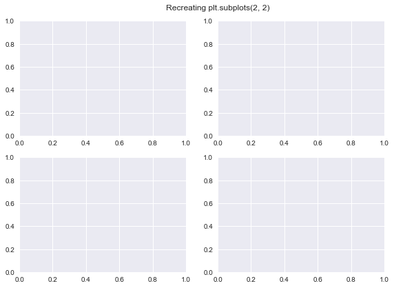
使用gridspec.GridSpec#
文档:https://matplotlib.net.cn/api/_as_gen/matplotlib.gridspec.GridSpec.html#matplotlib.gridspec.GridSpec
GridSpec对象使我们能够更直观地控制如何将图形精确地划分为子图以及每个Axes的大小。
您基本上可以确定一个网格,所有Axes在覆盖网格时都将符合该网格。
定义网格或GridSpec后,可以使用该对象生成符合网格的新Axes,然后可以将这些Axes添加到Figure中
让我们看看如何在代码中实现所有这些
您可以像这样定义一个GridSpec对象(这两个语句等效)
gs = mpl.gridspec.GridSpec(nrows, ncols, width_ratios, height_ratios)
# OR
gs = plt.GridSpec(nrows, ncols, width_ratios, height_ratios)
更具体地说
gs = plt.GridSpec(nrows=3, ncols=3, width_ratios=[1, 2, 3], height_ratios[3, 2, 1])nrows和ncols不言自明。width_ratios确定每列的相对宽度。height_ratios遵循相同的思路。整个grid始终使用它在图形中可用的所有空间进行自我分布(当您为单个图形使用多个GridSpec对象时,情况会有所不同,但这留给您去探索!)。在grid中,所有 Axes 都将符合已定义的大小和比率
def annotate_axes(fig):
    """Taken from https://matplotlib.net.cn/gallery/userdemo/demo_gridspec03.html#sphx-glr-gallery-userdemo-demo-gridspec03-py
    takes a figure and puts an 'axN' label in the center of each Axes
    """
    for i, ax in enumerate(fig.axes):
        ax.text(0.5, 0.5, "ax%d" % (i + 1), va="center", ha="center")
        ax.tick_params(labelbottom=False, labelleft=False)
fig = plt.figure()
# We will try and vary axis sizes here just to see what happens
gs = mpl.gridspec.GridSpec(nrows=2, ncols=2, width_ratios=[1, 2], height_ratios=[4, 1])<Figure size 576x396 with 0 Axes>
您可以将GridSpec对象传递给Figure,以按您想要的尺寸和比例创建子图,如下所示
请注意,Axes的大小如何与我们在创建网格时定义的比率相关。
fig.clear()
ax1, ax2, ax3, ax4 = [
    fig.add_subplot(gs[0]),
    fig.add_subplot(gs[1]),
    fig.add_subplot(gs[2]),
    fig.add_subplot(gs[3]),
]

annotate_axes(fig)
fig
以更简单的方式做同样的事情
def add_gs_to_fig(fig, gs):
    "Adds all `SubplotSpec`s in `gs` to `fig`"
    for g in gs:
fig.add_subplot(g)fig.clear()
add_gs_to_fig(fig, gs)
annotate_axes(fig)
fig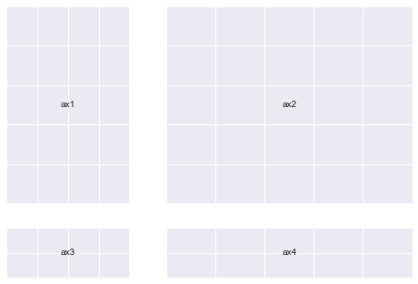
这意味着您现在可以这样做
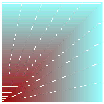
(请注意,Axes的大小从左上角到右下角逐渐增大)
fig = plt.figure(figsize=(14, 10))
length = 6
gs = plt.GridSpec(
nrows=length,
ncols=length,
width_ratios=list(range(1, length + 1)),
height_ratios=list(range(1, length + 1)),
)
add_gs_to_fig(fig, gs)
annotate_axes(fig)
for ax in fig.axes:
ax.plot(xs, ys)
plt.show()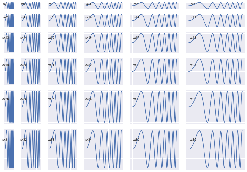
一个非常意外的观察结果:(这让我们获得了更多清晰度和能力)#
请注意,在每次打印操作之后,如何为每个gs对象打印不同的地址。
gs[0], gs[1], gs[2], gs[3](<matplotlib.gridspec.SubplotSpec at 0x1282a9e50>,
<matplotlib.gridspec.SubplotSpec at 0x12942add0>,
<matplotlib.gridspec.SubplotSpec at 0x12942a750>,
<matplotlib.gridspec.SubplotSpec at 0x12a727e10>)
gs[0], gs[1], gs[2], gs[3](<matplotlib.gridspec.SubplotSpec at 0x127d5c6d0>,
<matplotlib.gridspec.SubplotSpec at 0x12b6d0b10>,
<matplotlib.gridspec.SubplotSpec at 0x129fc6390>,
<matplotlib.gridspec.SubplotSpec at 0x129fc6a50>)
print(gs[0, 0], gs[0, 1], gs[1, 0], gs[1, 1])<matplotlib.gridspec.SubplotSpec object at 0x12951a610> <matplotlib.gridspec.SubplotSpec object at 0x12951a890> <matplotlib.gridspec.SubplotSpec object at 0x12951ac10> <matplotlib.gridspec.SubplotSpec object at 0x12951a150>
print(gs[0, 0], gs[0, 1], gs[1, 0], gs[1, 1])<matplotlib.gridspec.SubplotSpec object at 0x128fad4d0> <matplotlib.gridspec.SubplotSpec object at 0x1291ebbd0> <matplotlib.gridspec.SubplotSpec object at 0x1294f9850> <matplotlib.gridspec.SubplotSpec object at 0x128106250>
让我们了解为什么会发生这种情况
请注意,同一时间索引到一组gs对象如何只产生一个对象,而不是多个对象
gs[:, :], gs[:, 0]
# both output just one object each(<matplotlib.gridspec.SubplotSpec at 0x128116e50>,
<matplotlib.gridspec.SubplotSpec at 0x128299290>)
# Lets try another `gs` object, this time a little more crowded
# I chose the ratios randomly
gs = mpl.gridspec.GridSpec(
nrows=3, ncols=3, width_ratios=[1, 2, 1], height_ratios=[4, 1, 3]
)所有这些操作都只打印一个对象。这到底是怎么回事呢?
print(gs[:, 0])
print(gs[1:, :2])
print(gs[:, :])<matplotlib.gridspec.SubplotSpec object at 0x12a075fd0>
<matplotlib.gridspec.SubplotSpec object at 0x128cf0990>
<matplotlib.gridspec.SubplotSpec object at 0x12a075fd0>
让我们尝试将子图添加到我们的 Figure 中,以便 查看 发生了什么。
我们将进行一些不同的排列,以便准确地了解情况。
fig = plt.figure(figsize=(5, 5))
ax1 = fig.add_subplot(gs[:2, 0])
ax2 = fig.add_subplot(gs[2, 0])
ax3 = fig.add_subplot(gs[:, 1:])
annotate_axes(fig)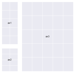
fig = plt.figure(figsize=(5, 5))
# ax1 = fig.add_subplot(gs[:2, 0])
ax2 = fig.add_subplot(gs[2, 0])
ax3 = fig.add_subplot(gs[:, 1:])
annotate_axes(fig)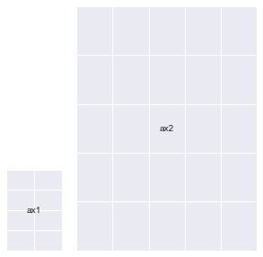
fig = plt.figure(figsize=(5, 5))
# ax1 = fig.add_subplot(gs[:2, 0])
# ax2 = fig.add_subplot(gs[2, 0])
ax3 = fig.add_subplot(gs[:, 1:])
annotate_axes(fig)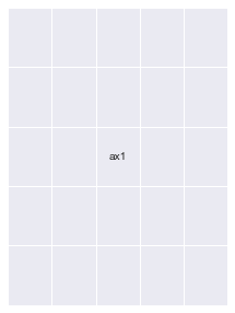
fig = plt.figure(figsize=(5, 5))
# ax1 = fig.add_subplot(gs[:2, 0])
# ax2 = fig.add_subplot(gs[2, 0])
ax3 = fig.add_subplot(gs[:, 1:])
# Notice the line below : You can overlay Axes using `GridSpec` too
ax4 = fig.add_subplot(gs[2:, 1:])
ax4.set_facecolor("orange")
annotate_axes(fig)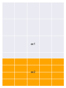
fig.clear()
add_gs_to_fig(fig, gs)
annotate_axes(fig)
fig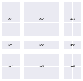
以下是对此含义的要点总结
gs可以用作各种Axes的工厂。- 您通过索引
Grid中的特定区域来向此工厂下订单。它返回一个单独的SubplotSpec对象(检查type(gs[0]),该对象可以帮助您创建一个Axes,它将您索引的所有区域组合成一个单元。 - 您索引部分的
高度和宽度比例将决定生成的Axes的大小。 Axes将始终根据您的高度和宽度比例保持相对比例。- 出于所有这些原因,我喜欢
GridSpec!
GridSpec 提供的这种创建不同网格变体的能力可能是我们之前看到的异常现象(打印不同的地址)的原因。
每次索引它都会创建新对象,因为将所有 SubplotSpec 对象的排列存储到内存中的一个组中会非常麻烦(尝试计算 10x10 的 GridSpec 的排列,您就会知道原因了)。
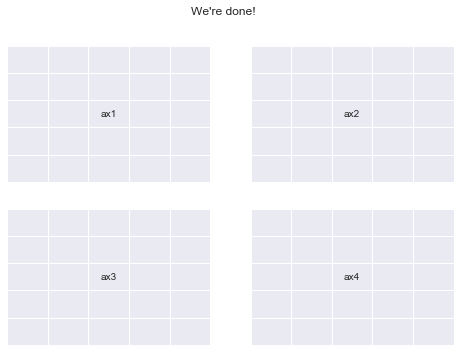
现在,让我们再次使用 GridSpec 创建 plt.subplots(2,2)#
fig = plt.figure()
gs = mpl.gridspec.GridSpec(nrows=2, ncols=2)
add_gs_to_fig(fig, gs)
annotate_axes(fig)
fig.suptitle("We're done!")
print("yayy")
yayy
您应该尝试什么:#
以下是一些我认为您应该继续探索的内容
- 同一图的多个
GridSpec对象。 - 有效且有意义地删除和添加
Axes。 mpl.figure.Figure和mpl.axes.Axes可用的所有方法,使我们能够操纵它们的属性。- Kaggle Learn 的数据可视化课程是一个学习使用 Python 进行有效绘图的好地方
- 掌握了这些知识,您将能够使用其他绘图库(如
seaborn、plotly、pandas和altair)更加灵活地进行操作(您可以将Axes对象传递给它们的所有绘图函数)。我鼓励您也探索这些库。
这是我第一次为互联网编写任何技术指南,它可能不像一般的教程那样干净。但是,我乐于接受您可能对我的任何建设性批评(请给我发邮件至 akashpalrecha@gmail.com)